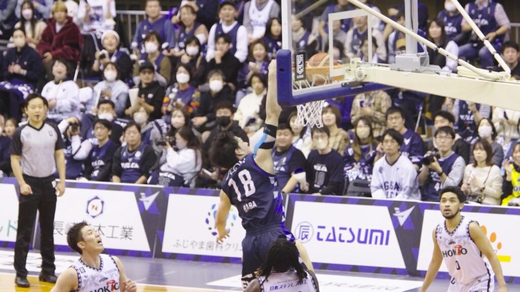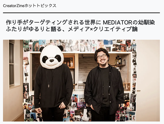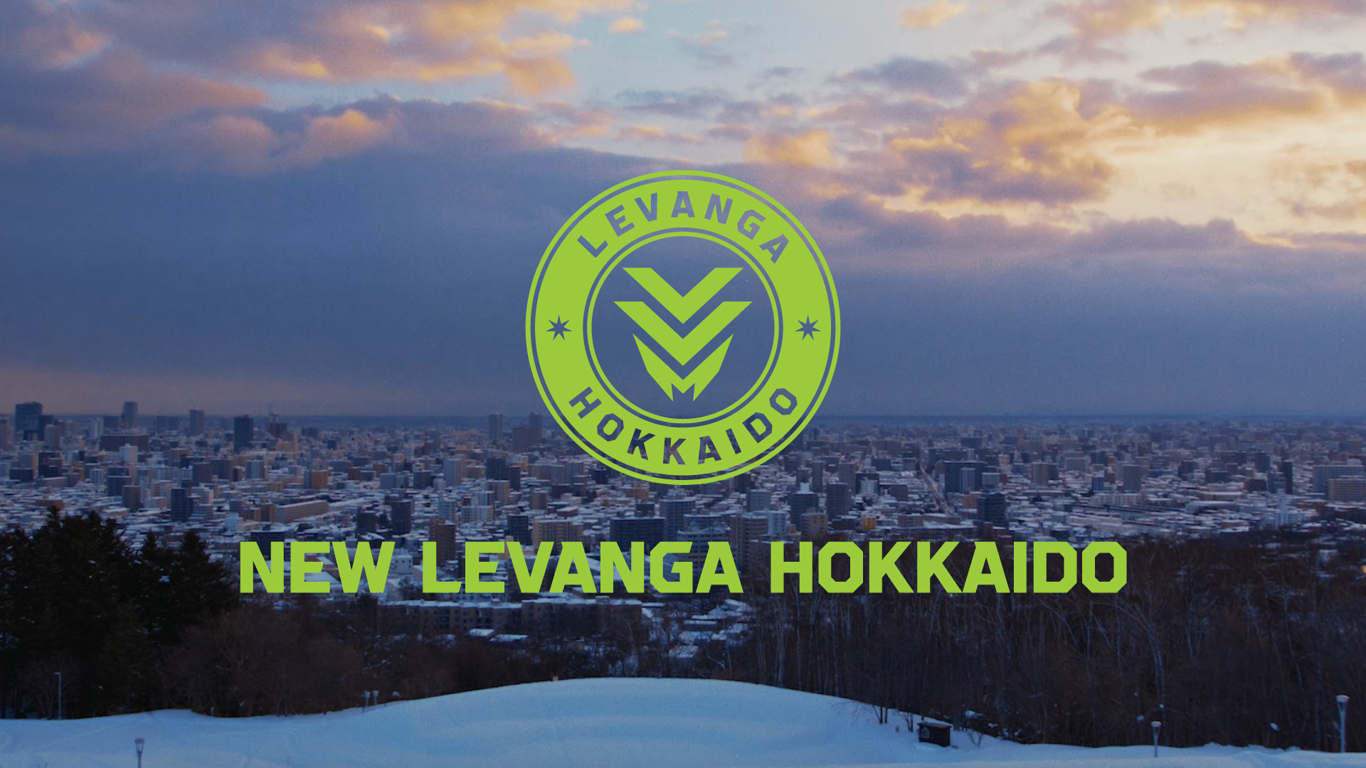
LEBANGA HOKKAIDO Rebranding Project
LEVANGA HOKKAIDO Inc.
MEDIA
SOLUTION
ANREAL STUDIOは、Bリーグ・レバンガ北海道のクラブ創立15周年、
そして2026-27シーズンからリーグが大きな変革を迎える「B.革新」
初年度に向けたリブランディングプロジェクトを、
戦略策定からクリエイティブ表現まで全工程にわたって主導しました。
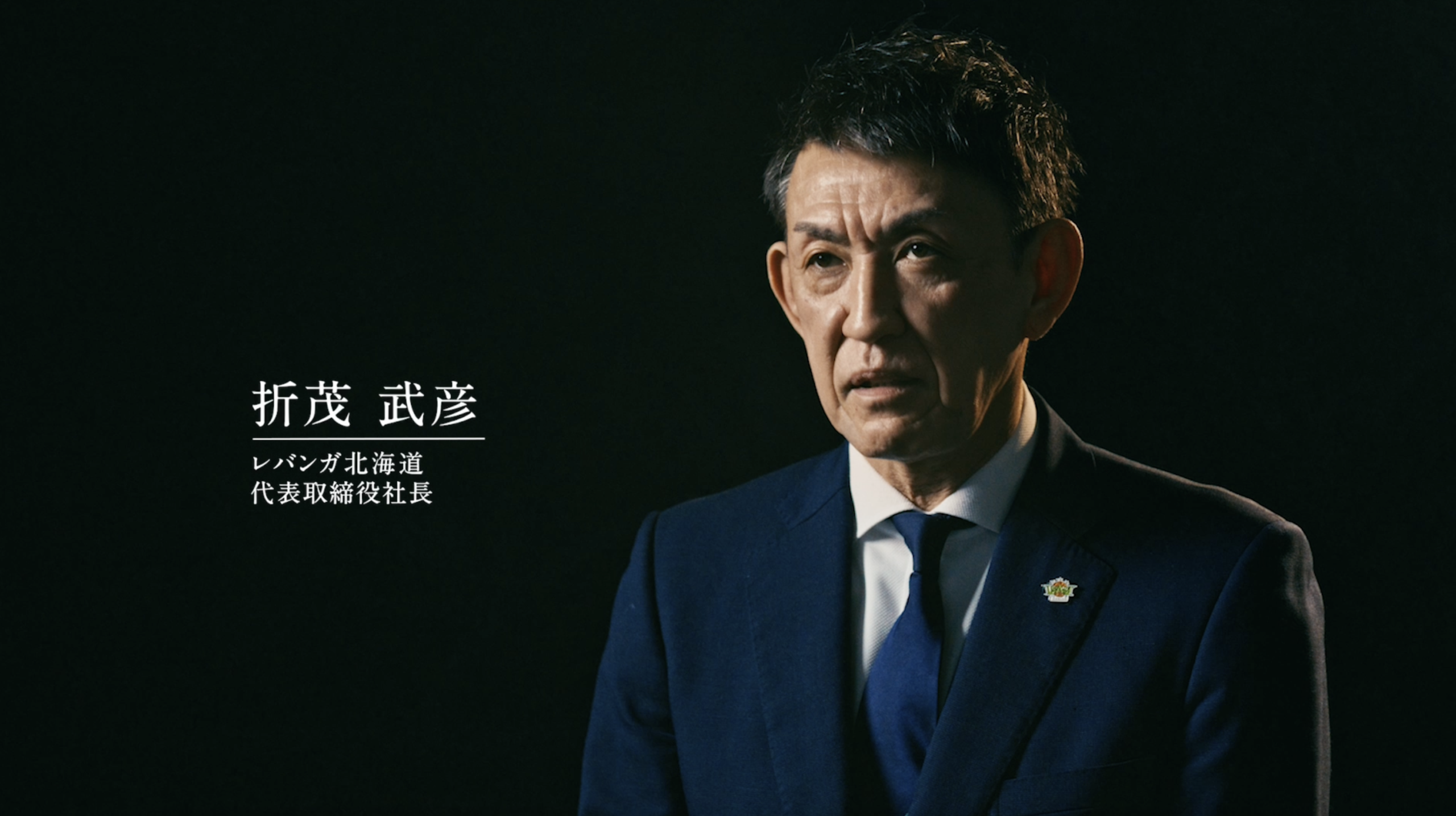
また、このリブランディングをきっかけに、2026年3月よりANREAL STUDIO代表のオノダタカキは、
レバンガ北海道のブランドディレクターに就任。
今後クラブが発信するすべてのクリエイティブのディレクションを行うことが決定しました。
本プロジェクトは、単なるロゴのアップデートではなく、
北海道からスポーツの新たな価値を生み出すための「アイデンティティの再定義」です。
クラブのMISSION・VISION・VALUEの刷新を起点に、新ロゴ、シンボルマーク、
オリジナルタイポグラフィ、デザインコンセプト、
スペシャルサイト、コンセプトムービーまでを一貫して設計。
「変えるべきもの」と「変えてはいけないもの」を見極めながら、
クラブが積み重ねてきた15年の歩みを次の景色へとつなぐ、ブランドの土台そのものを再構築しました。
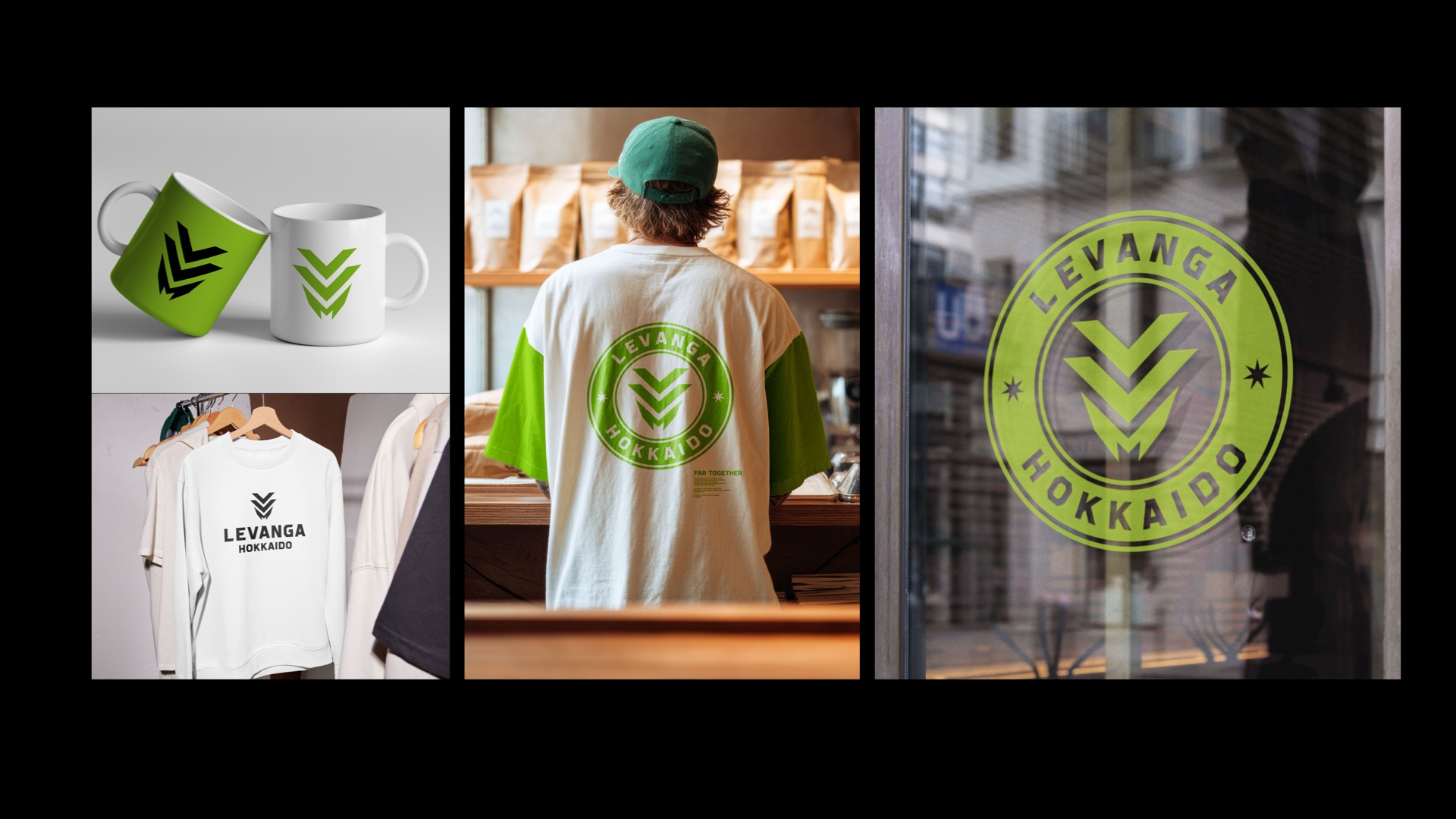
CONCEPT|For All People, All Place
新たなブランドの根幹に据えたのは、
「誰もが過ごす毎日そのものがホームコート」という考え方です。
試合会場だけでなく、街中やオフィスなど、
あらゆる日常のシーンに溶け込む可変性の高いデザインを開発。
スポーツを“特別な瞬間”から“暮らしの中”へと広げ、北海道の風景に溶け込みながら、
何気ない毎日を誇りある一瞬へと変えていく。
その思想を、エンブレム、シンボルマーク、オリジナルフォントのすべてに宿しました。
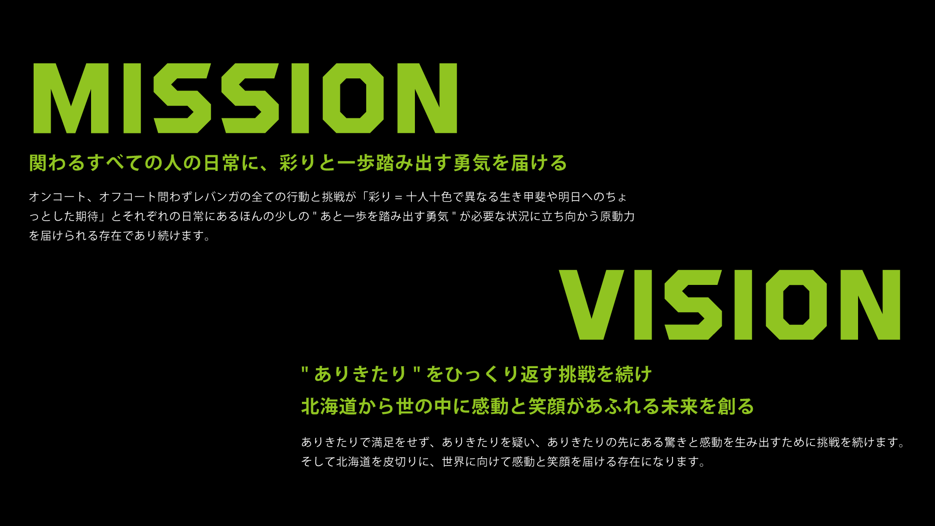
このコンセプトは、新たに定義したMISSION
「関わるすべての人の日常に、彩りと一歩踏み出す勇気を。」と一対をなすものです。
オンコート・オフコートを問わず、
クラブのあらゆる行動と挑戦が人々の「明日への原動力」になる。
その存在意義を、言葉とデザインの両面から設計しました。
SCOPE OF WORK|ANREAL STUDIOが手がけた領域
ANREAL STUDIOは本プロジェクトにおいて、以下の全工程を一貫して担当しました。
01|Brand Strategy / Philosophy Development
“Go For It,” “Play with Joy,” and “Hokkaido Pride,” building the core framework of the brand.
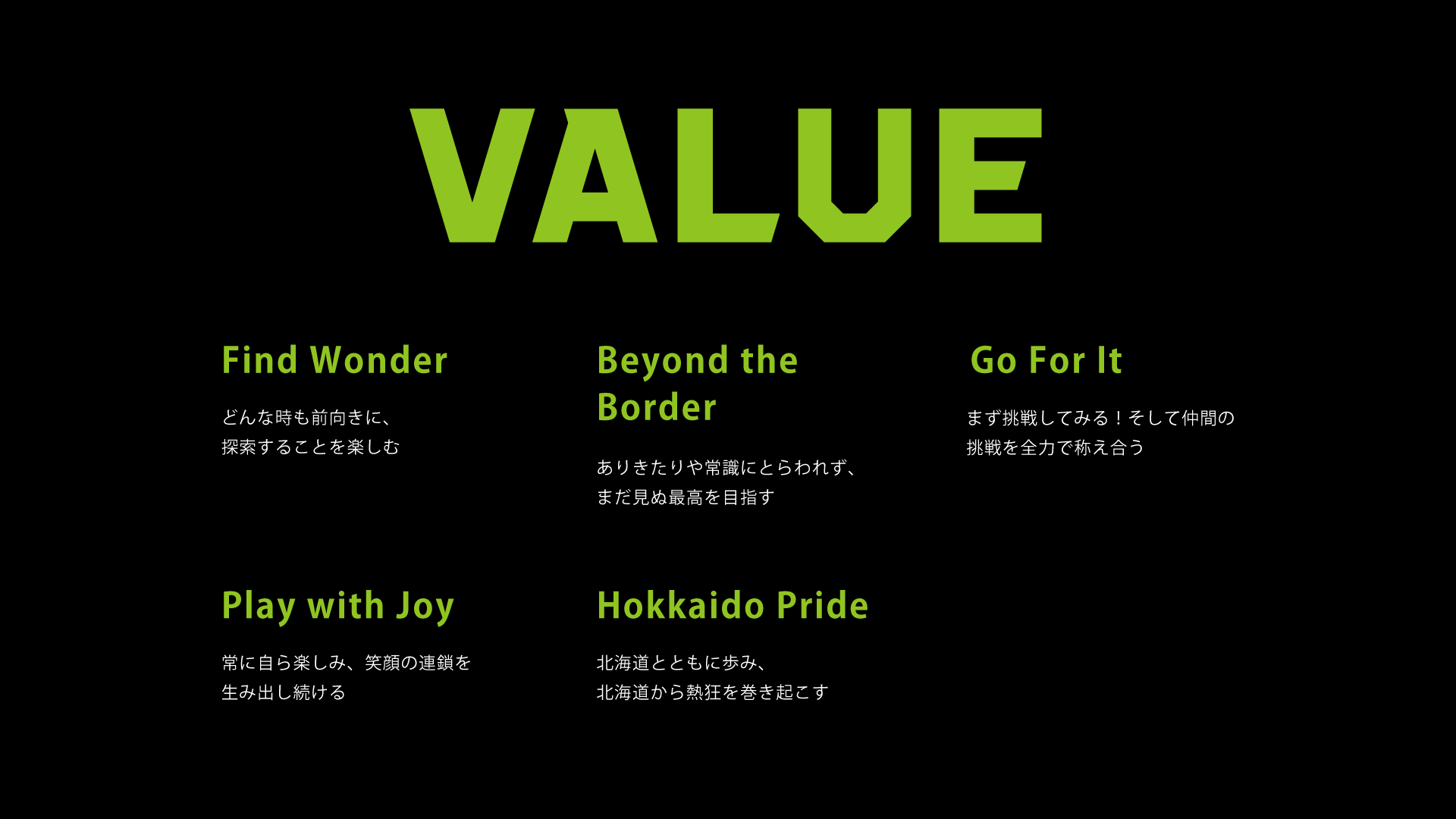
クラブのMISSION・VISION・VALUEを再定義。行動指針として
「Find Wonder」「Beyond the Border」「Go For It」
「Play with Joy」「Hokkaido Pride」の5つのVALUEを策定し、
ブランドの背骨を構築しました。
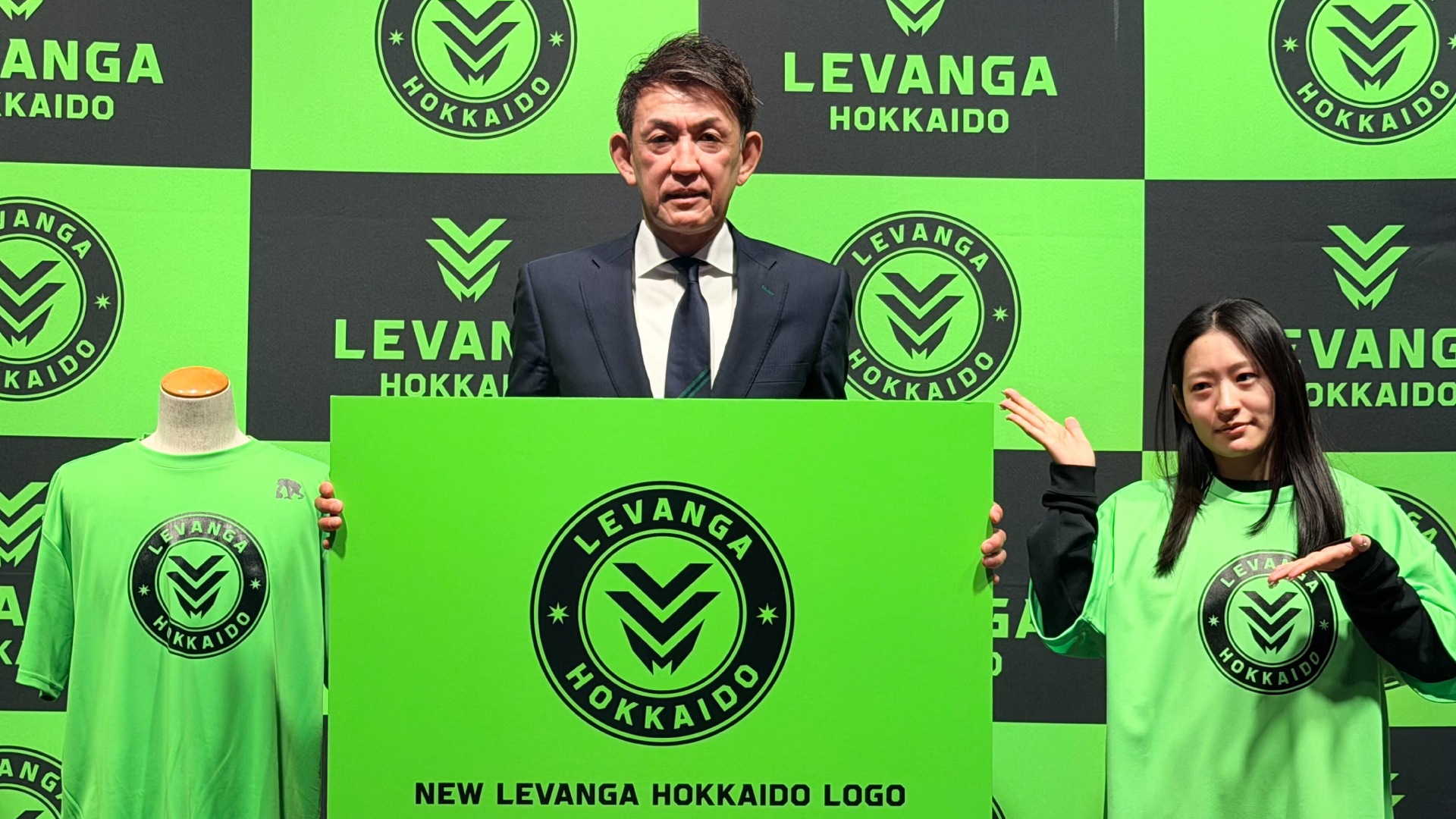
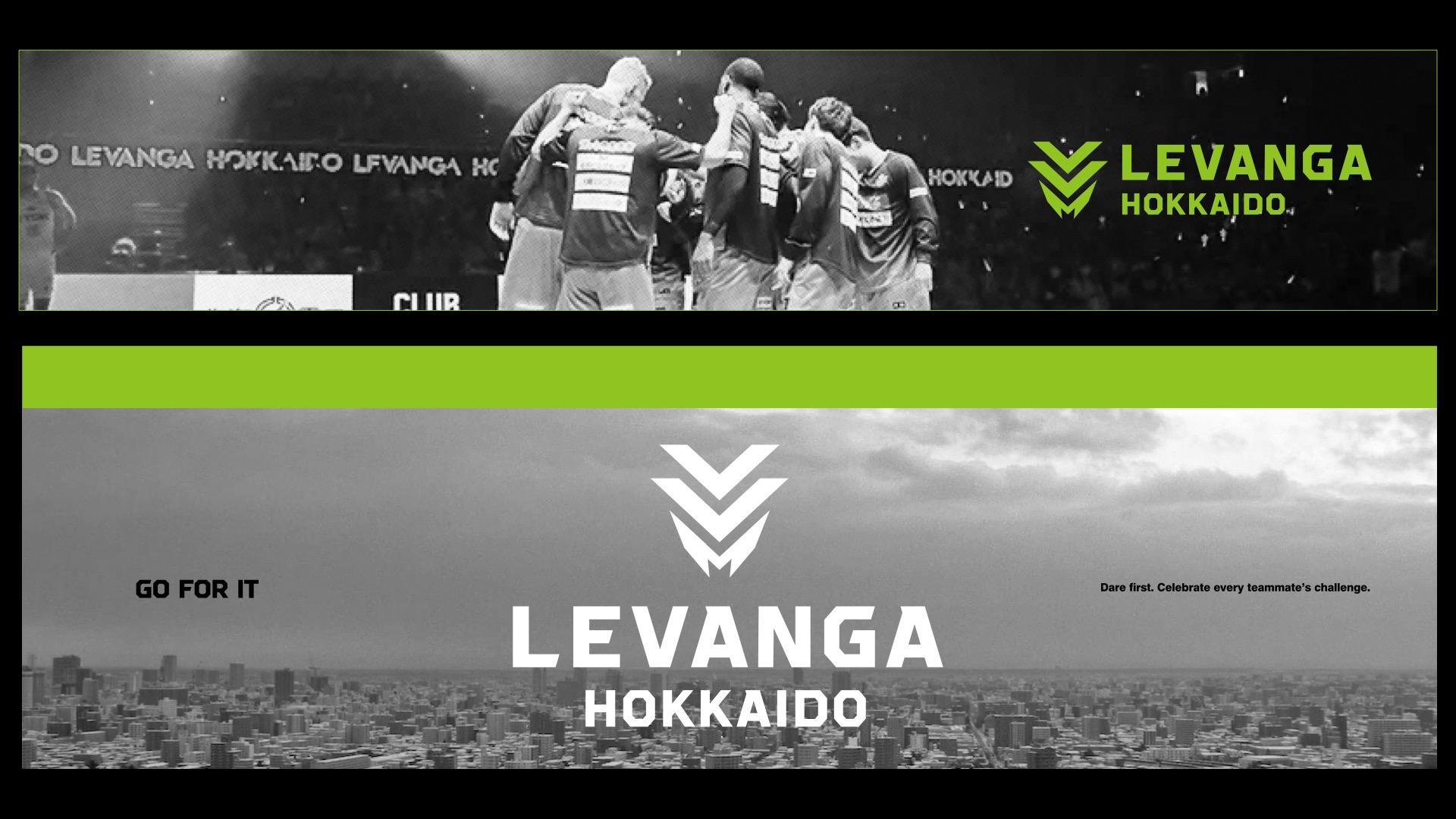
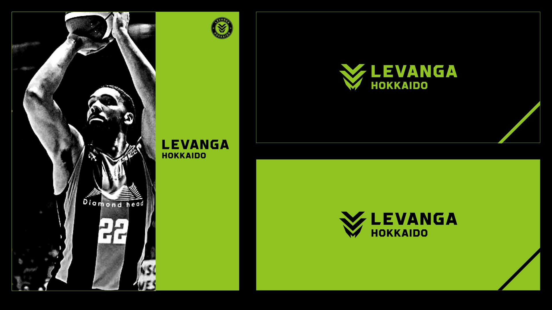
02|Logo / Emblem
クラブの伝統と新たな決意を両立させる新ロゴを開発。
用途に応じて展開できるロゴバリエーションまでを設計しました。
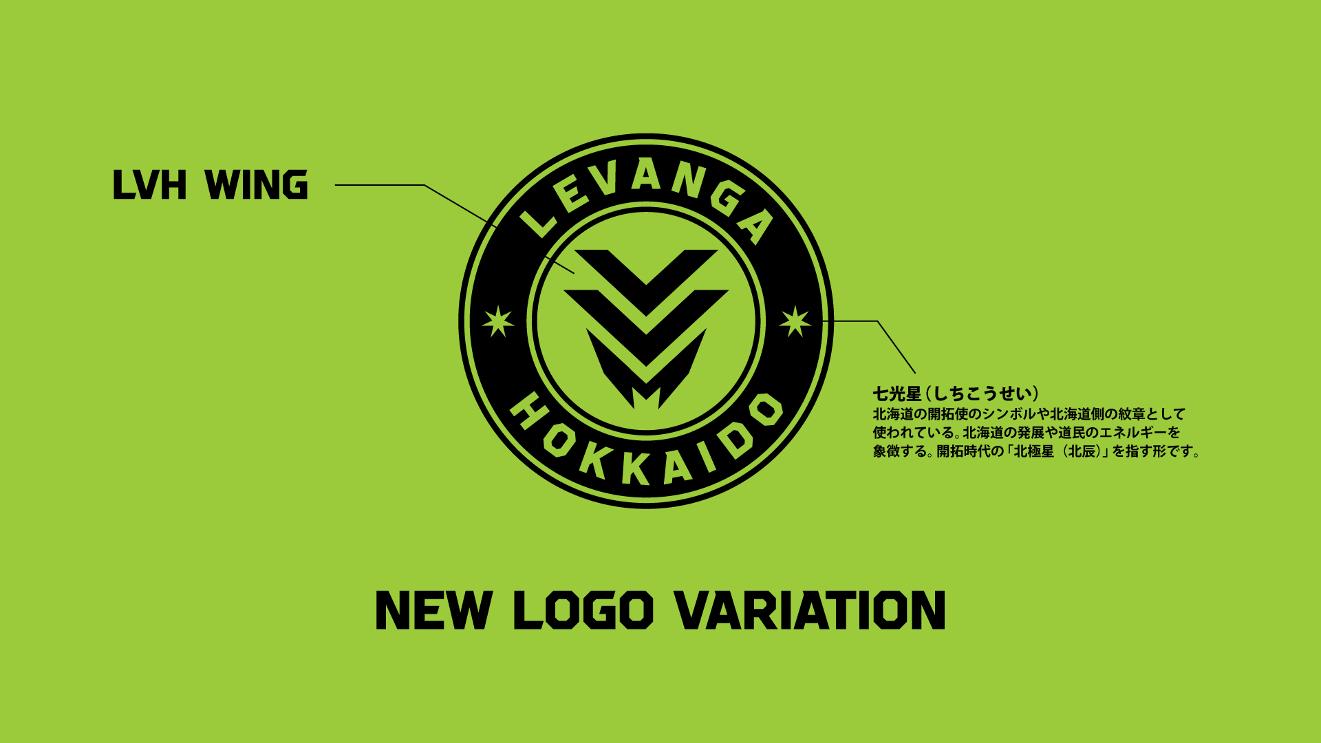
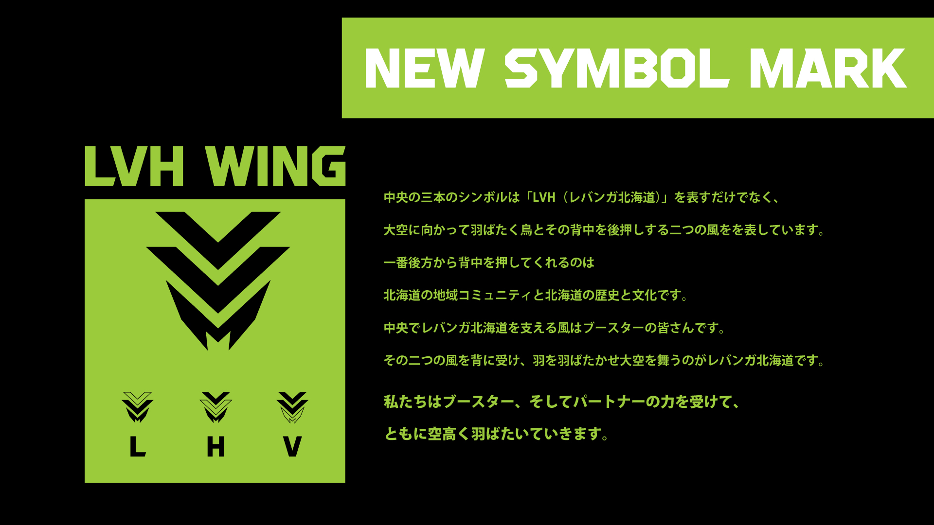
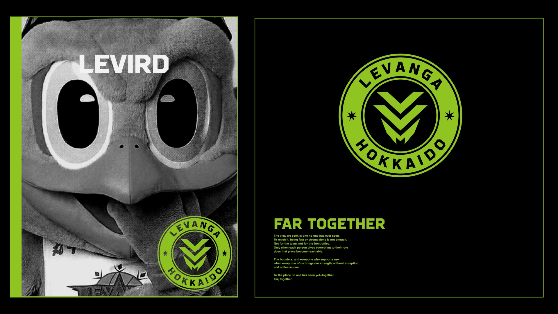
03|Symbol Mark
クラブの略称「LVH(Levanga Hokkaido)」を象りながら、
大空へ羽ばたく鳥を表現した新シンボルを開発しました。
鳥の背中を押す2つのラインには、「北海道の地域コミュニティ・歴史・文化」と
「ブースター」という2つの追い風を込め、
周囲の支えを力に変えて舞い上がるクラブの姿勢を象徴させました。
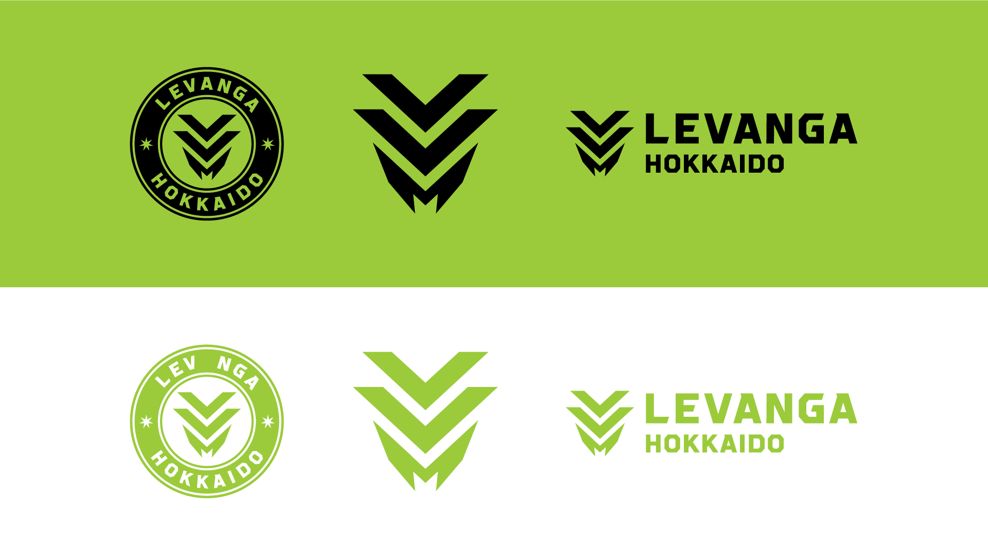
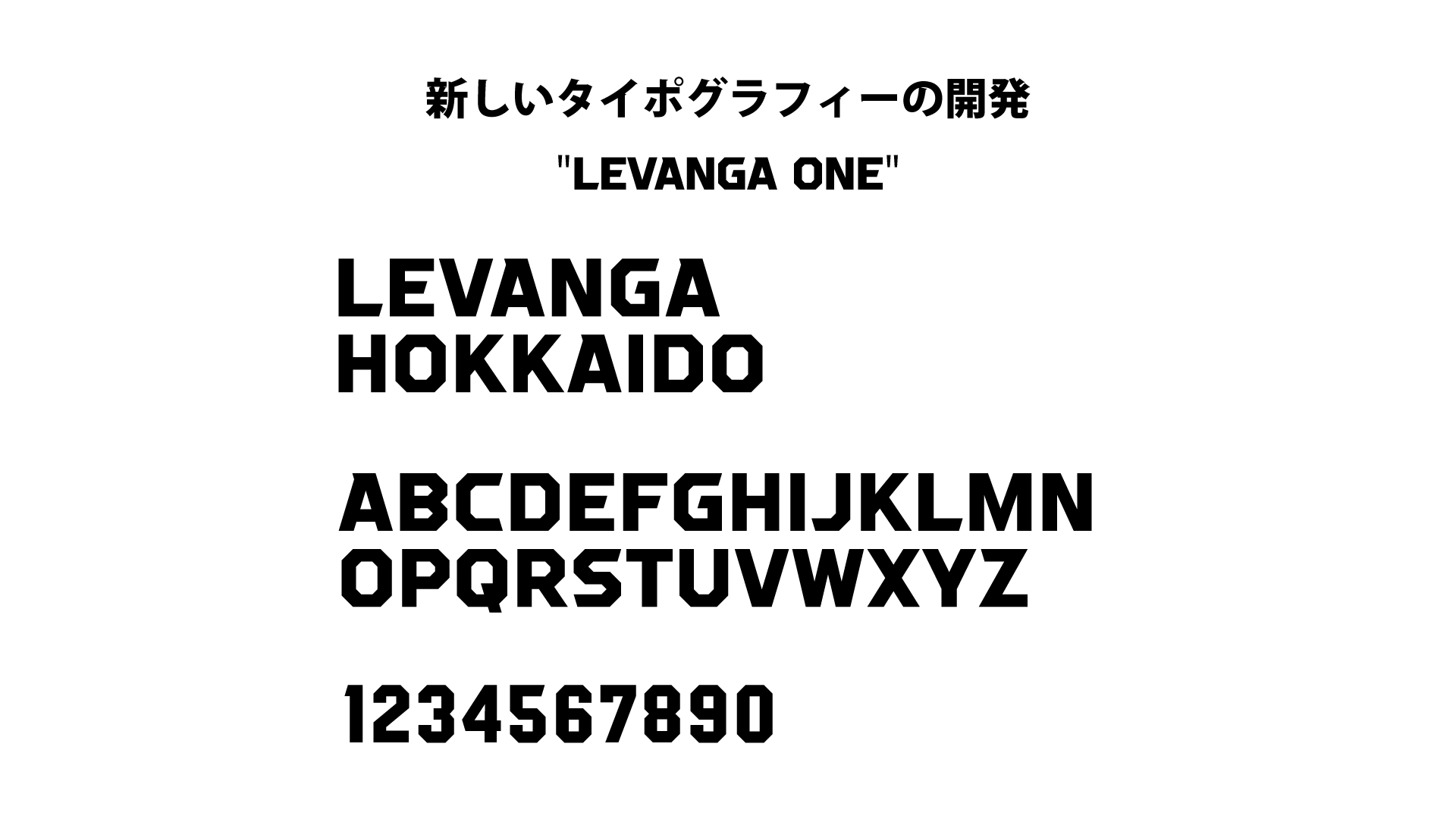
04|Original Typography
ブランドの世界観を体現する独自のタイポグラフィを新規開発。
あらゆる場面でクラブの“らしさ”を一貫して伝える、
可変性の高いビジュアル基盤としました。
05|Design Concept / Guidelines
「For All People, All Place」を軸に、
ビジュアルアイデンティティ全体の思想と運用を体系化しました。
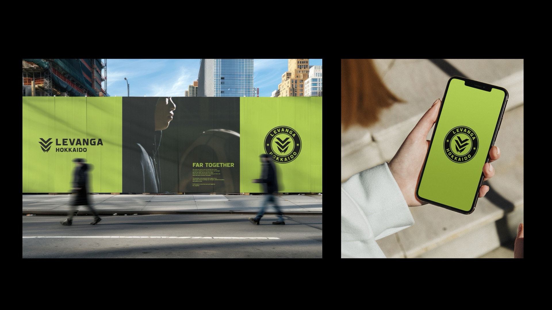
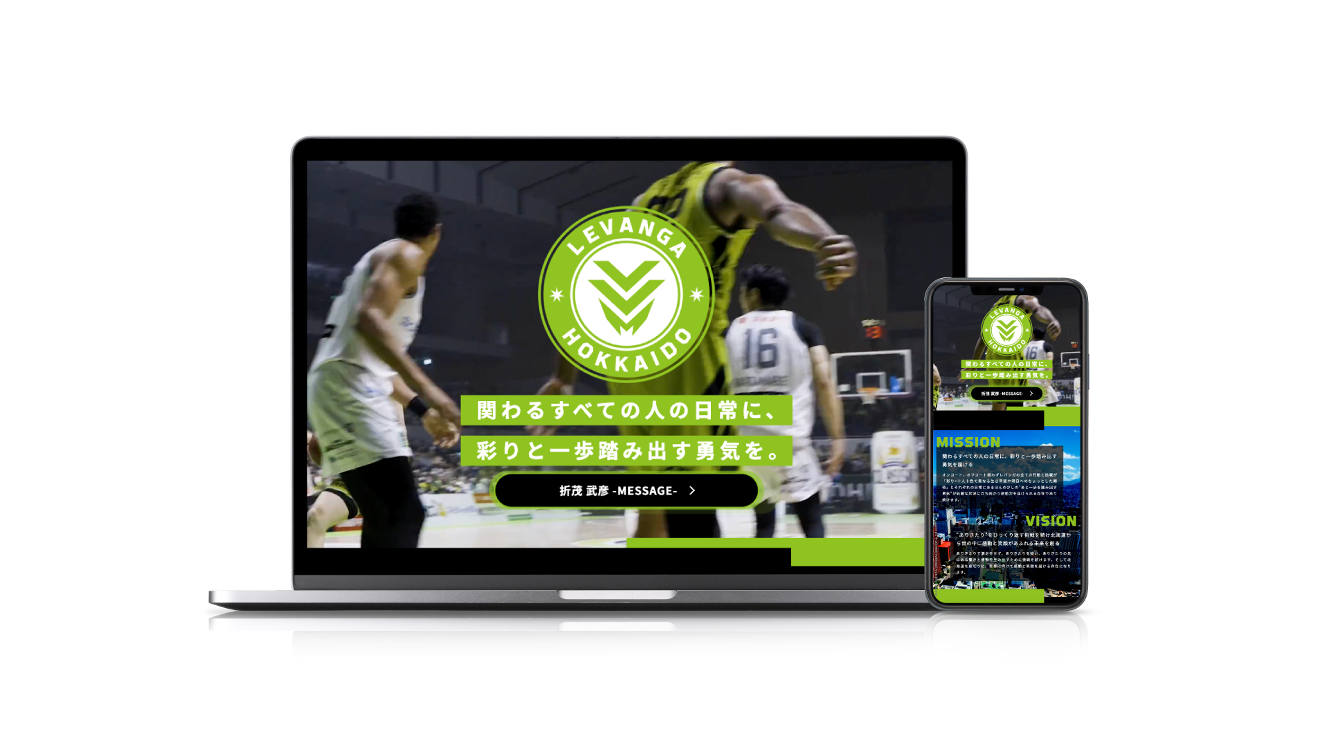
06|Special Website / Concept Movie
リブランディングの世界観を発信するスペシャルサイト
「BRANDNEW LEVANGA HOKKAIDO」およびコンセプトムービーを制作。
発表に向けた対外発信までを設計しました。
STORY|変える勇気と、守る覚悟
リブランディングにあたり、私たちが最も大切にしたのは、
「変えるべきもの」と「変えてはいけないもの」を見極めることでした。
理念やビジュアルを大胆に刷新する一方で、
クラブ名「レバンガ」と「レバンガグリーン」は守り抜く。
その判断を、クラブと共に丁寧に積み上げました。
“頑張れ”をひっくり返した言葉である「レバンガ」。
そして、北海道の長い冬を越えて芽吹く新緑を
「何度も立ち上がってきた証、希望の色」として受け継ぐ「レバンガグリーン」。
クラブの原点に宿るこの2つを継承の核として残し、
その上で新たな理念とデザインを重ねることで、過去を否定せず、
これまでの歩みへの敬意を保ったまま、
さらに高い景色へと向かうブランドを実現しました。
RESULT|プロジェクトの成果
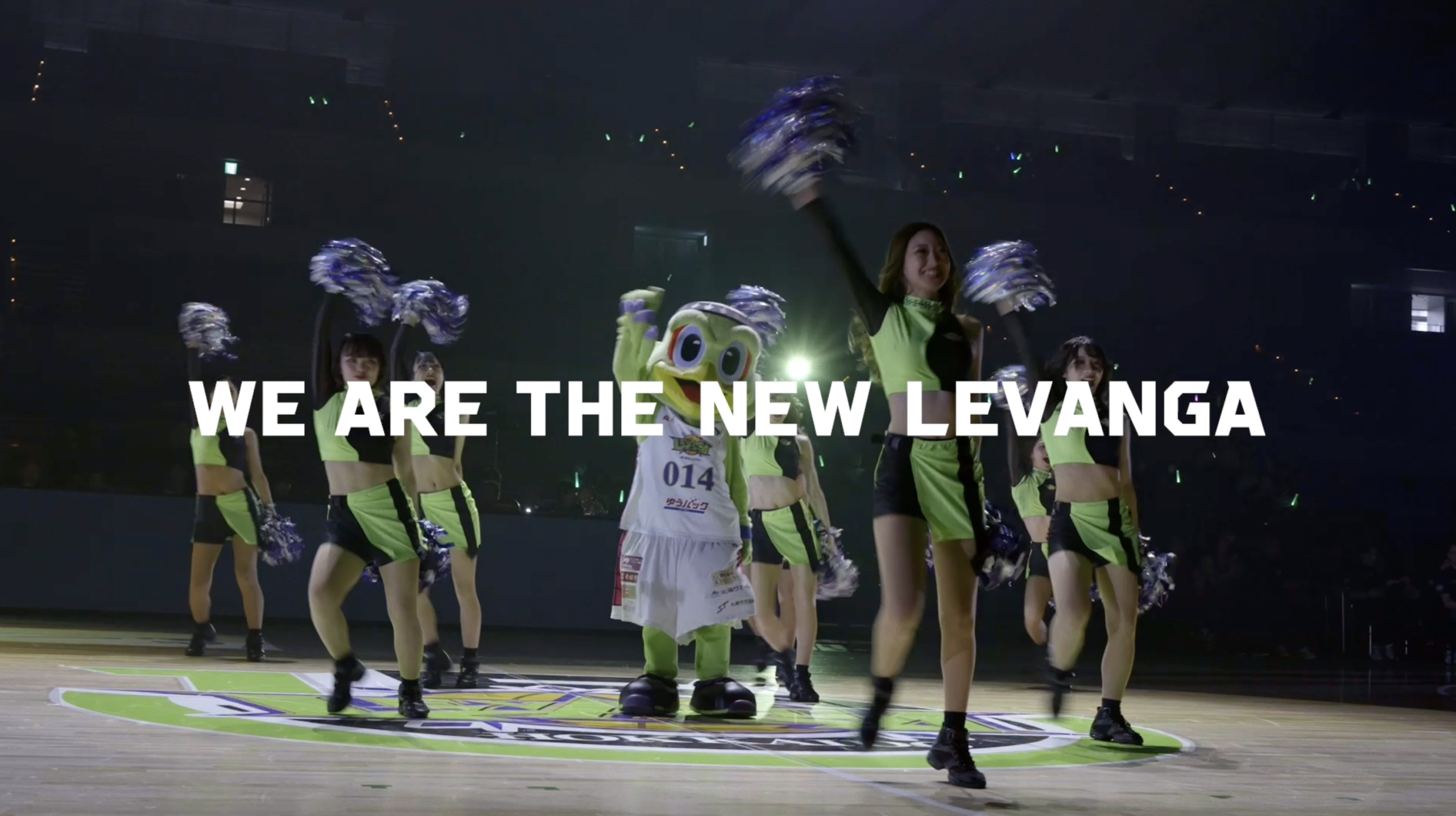
2026年3月3日の発表後、本リブランディングは
Bリーグ公式メディアをはじめ各メディアで取り上げられ、
クラブの新たな船出として広く注目を集めました。
北海道の伝統のカラーを背負いながら、新たなロゴを胸に、
レバンガ北海道はBリーグの新時代へと大きな一歩を踏み出しています。
ANREAL STUDIOは、ブランドの思想設計から、言葉、ロゴ、タイポグラフィ、ビジュアル、
発信までを横断的に統合し、クラブのアイデンティティを再定義しました。
スポーツチームのブランドが持つ可能性を、
「日常そのものをホームコートに変える」という視点から拡張した実績です。
ANREAL STUDIO led the rebranding project for Levanga Hokkaido,
a B.LEAGUE basketball club, in preparation for the club’s 15th anniversary and the first year of
“B.革新,” a major transformation of the league beginning in the 2026–27 season.
The project covered the entire process, from brand strategy to creative expression.
Following this rebranding, ANREAL STUDIO’s representative, Takaki Onoda,
was appointed Brand Director of Levanga Hokkaido from March 2026,
and will oversee the creative direction of all future brand communications for the club.
This project was not simply a logo update, but a redefinition of
the club’s identity in order to create new value for sports from Hokkaido.
Starting with the renewal of the club’s MISSION, VISION, and VALUE, we designed the new logo,
symbol mark, original typography, design concept, special website, and concept movie
as one integrated brand system. By carefully identifying what should change and
what should remain unchanged, we rebuilt the foundation of the brand,
connecting the club’s 15-year history to its next stage.
CONCEPT|For All People, All Place
At the core of the new brand is the idea that
“everyday life itself can become a home court for everyone.”
We developed a flexible visual identity that can naturally exist not only in the arena,
but also in everyday scenes such as the city, the office, and the places where people live.
The concept expands sports from a special moment into daily life,
transforming ordinary moments into something to be proud of within the landscape of Hokkaido.
This philosophy is embedded in the emblem, symbol mark, and original typography.
The concept also works together with the newly defined MISSION:
“To bring color and the courage to take a step forward into the everyday
lives of everyone connected to the club.”
Whether on the court or off the court, every action and challenge by the club is
designed to become a source of energy for tomorrow. We shaped
this purpose through both words and design.
SCOPE OF WORK|ANREAL STUDIOが手がけた領域
ANREAL STUDIO was responsible for the following areas throughout the project.
01|Brand Strategy / Philosophy Development
We redefined the club’s MISSION, VISION, and VALUE. As behavioral principles,
we developed five values: “Find Wonder,” “Beyond the Border,”
02|Logo / Emblem
We developed a new logo that balances the club’s tradition with
its new determination. We also designed logo variations that
can be used flexibly across different applications.
03|Symbol Mark
We developed a new symbol mark based on the abbreviation “LVH,”
representing Levanga Hokkaido, while also expressing the image
of a bird soaring into the sky.
The two lines pushing the bird forward represent two sources
of tailwind: the local communities,
history, and culture of Hokkaido, and the club’s boosters.
The symbol expresses the club’s attitude of transforming
support from those around it into the strength to rise higher.
04|Original Typography
We developed original typography that embodies the brand’s worldview.
It serves as a flexible visual foundation that consistently communicates the
club’s unique identity across every touchpoint.
05|Design Concept / Guidelines
Based on the concept “For All People, All Place,”
we systematized the overall philosophy and usage of the visual identity.
06|Special Website / Concept Movie
We produced the special website “BRANDNEW LEVANGA HOKKAIDO”
and a concept movie to communicate the worldview of the rebranding.
We also designed the external communication for the announcement.
STORY|変える勇気と、守る覚悟
In this rebranding project, what we valued most was identifying
what should change and what should never be changed.
While boldly renewing the club’s philosophy and visual identity,
we preserved the club name “Levanga” and the “Levanga Green.”
This decision was carefully built together with the club.
“Levanga” comes from reversing the Japanese word “ganbare,”
meaning “keep going” or “do your best.”
“Levanga Green” represents the fresh green that emerges after
Hokkaido’s long winter, and has been passed down as a color
of hope and proof of the club’s resilience.
By keeping these two elements as the core of continuity,
and layering a new philosophy and design on top of them,
we created a brand that moves toward a higher stage while
respecting the club’s past and the path it has walked.
RESULT|プロジェクトの成果
After its announcement on March 3, 2026, the rebranding
gained attention across various media, including official
B.LEAGUE channels, as a new beginning for the club.
Carrying the traditional colors of Hokkaido and wearing a new logo on its chest,
Levanga Hokkaido has taken a major step into a new era of the B.LEAGUE.
ANREAL STUDIO redefined the club’s identity by integrating brand philosophy,
language, logo, typography, visuals, and communication.
This project expanded the potential of a sports team brand through
the perspective of turning everyday life itself into a home court.
CREDIT
- CREATIVE DIRECTOR
- TAKAKI ONODA
- PRODUCER
- TAKUMA ISO
- ART DIRECTOR
- GAKU ITO
- PROJECT MANAGER
- TAKAMITSU KASE
- DIRECTOR
- YU SANBONSUGE
- WEB DIRECTOR
- ARATA HIYAJO